Top 9 web design trends of 2022
Cultural shifts occurred worldwide and had a significant impact on design trends. In the digital design world, we’ve seen a lot of significant developments this year. Some of these design trends are expected to continue in 2022.
Designers have been challenged to recreate real-life experiences and make them available digitally due to our distant, stay-at-home reality.
Web designer Dublin has answered the challenge by experimenting with various visual communication methods that can boost engagement. Novel font art, distinctive colour palettes, and 3D product simulations for online buyers are just a few examples.
Every issue, it is said, is an opportunity disguised as a problem. We can look beyond the traditional means of doing business in these challenging times. More businesses than ever before are relocating their offices and shops online. The desire to establish and grow an internet presence has resurfaced.
Today, let’s discuss the top 9 website design trends of 2022
1. Minimalistic designs
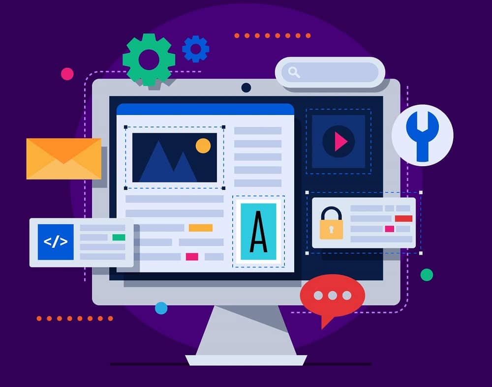
Minimalism has ascended to the throne and has become a new style in modern life, including website design. Humans are only interested in certain aspects of a design, so web designs with few details are easy to recognize and remember.
The principle of minimalism is simple: “The lesser is the design, the more attractive it looks.” Utilizing “less is more” in website design means using only the components required for users to focus on the content. However, it’s important to note that adding more features to your design doesn’t always equal more value.
Below mentioned are a few rules that should be followed while opting for this style:
- The user interface should be easy to use.
- Font with a minimalist style.
- Images in a considerable format.
- No more than three colours should be displayed on the minimalism website.
- There shouldn’t be any unnecessary details (such as colour transitions, textures, or shadows).
- There should be no additional button.
Let’s understand the pros and cons of this website design:
Advantages
i. Efficient conversions
The effective use of negative space drives the user’s attention to the text and CTAs, effectively converting consumers. Conversion paths are apparent when users are not distracted by clutter or excessive information.
ii. Quick loading
It’s become common knowledge that page loading speed is an essential component of the user experience, and page speed has recently gained prominence. You have users who are constantly on the move. Instead of waiting for a website to load, people are more inclined to go somewhere else. Websites with few effects and neat features are always quick to load.
Disadvantages
i. Not expressive
It will be challenging to express all the information about the products and services because the design focuses on utilizing fewer words, more images, and less depth. A different layout could be more suited with so much information to provide.
ii. Blank
Minimalism can be taken too far, and the website appears sparse, as if it’s missing something. Specific industries, products, and services may necessitate a more dynamic, bright design.
2. Retro trends
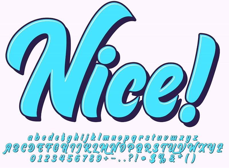
Let’s fly to our ‘Old is Gold’ statement. So, a lot of things did become cool again, just to turn out to be much less cool. Think about it: handlebar moustaches with mom jeans. In the end, irony has a limited shelf life.
Ancient typography has proven to be a poor choice for many projects. The rise and fall of retro fonts has been the same.
Retro typography is gaining popularity again. But, this time, we do not see the similar types of old fonts. On the other hand, styling and a splash of artistry redefine what the vintage fonts are like.
In recent times many brands started using retro styles. We can see this in promotions like Spotify’s Carnival campaign. In contrast, they play with standard typefaces, the bold ones, to give them a new life. This is an excellent example of taking traditional fonts and giving them a cool, modern twist while preserving legibility.
Many unique creations like this come alive from the creative minds of web designer Dublin.
3. 3D visuals
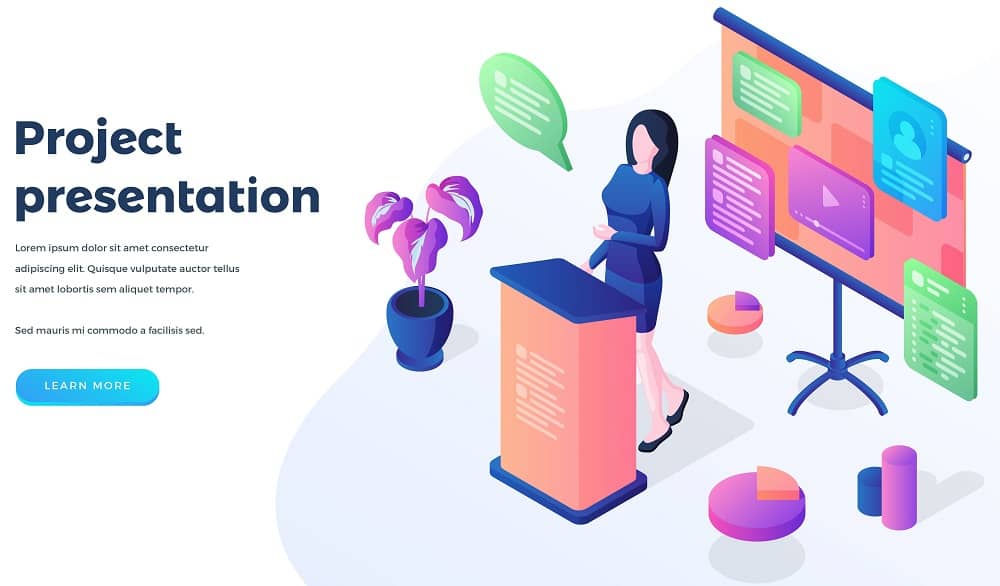
Compared to beveled and blocky edges of Geocities’, 3D design has improved tremendously with higher-resolution screens. Instead, three-dimensional images of a very high-quality have been included into the design of the internet. To the contrary, they enhance the entire experience of the user rather than being invasive.
Many creative minds in Web design Dublin, Ireland, use 3D components across their website to add depth. There’s a good sense of harmony between all of the design aspects. This is an excellent illustration of how 3D can have a more substantial impact on more simple layouts.
3D elements give any website a sense of originality and richness. It creates a kind of illusion that makes people attract and feel surprised. It helps in the increase of traction to the website.
Website design Dublin has gained expertise in designing kickass web design according to the website trends.
4. Black and white illustrations
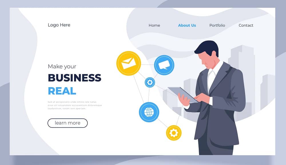
Black and white illustration design trends once upon a time in the journalism industry, when colour printing was not an option. Instead, the newspaper displayed a black-and-white hand-painted design created by a cartoonist to add an artistic effect to the content and inspired by cartoons. This unique style made up for the lack of colour images and photographs.
The cartoonist also began using black texture-based illustrations to complement the large amount of text that must be included in newspapers and similar publications. The advantage of these graphic elements is that they balance text articles by reducing the cognitive burden on the reader with simple, attractive images.
But today, texture-based illustrations are created digitally.
This inevitably means it looks slightly different from the hand-painted previous work. This subtle change will slightly impact the design—more uniform shades of black and more accurate symmetry and alignment. For instance, The Mail chimp home page shows this dichotomy because the hero’s image style is slightly different from the three-column section of the three black digital illustrations.
5. Interactive web designs
Interactive website components are becoming increasingly popular, and the user experience animation attracts more people. As a result, customers spend more time on responsive and interactive websites.
Unfortunately, implementing UX design concepts like these may be costly and time-consuming. However, more automated development techniques are yet to emerge, lowering expenses for clients who want distinctive, interactive components on their websites.
6. Multimedia experiences

Due to internet speed, users can experience more multimedia, and hence multimedia websites are growing popular. Multimedia can help you liven up your website. For example, instead of overloading users with text, you provide them with a visual option.
Furthermore, website designs in 2022 will be expected to use multimedia while adhering to the following guidelines:
- Multimedia combines motion and sound in a non-distracting way.
- Use alt text to describe your photographs and extended descriptions if they’re complicated.
- Allows users to personalize the playback of video/motion content.
7. Neumorphism

Neumorphism became popular in the web design world at the start of 2019 and has since gained traction. As a result, Neumorphism is expected to be one of the primary website design Dublin, Ireland trends in 2022.
Neumorphism (also known as neo-skeuomorphism) is a design style that concentrates on the movement of light. Using selective drop shadows to mimic physicality mixed with semi-flat colours to produce a genuine 3D sense is a common feature of this approach.
In many ways, this technique is analogous to digital embossing or debossing. Designers can reclaim the tactile sense they lost when creating flat surfaces by including tactile features. As a result, the emotional bond between the user and the design they’re interacting with is strengthened.
The disadvantages of Neumorphism include accessibility and space constraints. Lights and shadows are used throughout the design. Contrast can be challenging to achieve, and unskilled designers are prone to making mistakes that harm the design.
Each element must be created manually, which takes extra time. In addition, some elements will require additional work depending on what they are imitating.
8. Gaussian blur

Gaussian blur is fantastic for giving photos and gradients a swirl of soft focus. This effect has been long-lasting, but it’s only recently become increasingly popular in online designs.
Many brands have been using this effect recently. For instance, Moment House’s site starts with a lovely gaussian haze of colour rather than a hero image. This creates a moody atmosphere and connects to the Los Angeles cityscape photo that follows. It accurately portrays the golden light and haze through which Los Angeles is seen.
9. AR experiences
Web augmented reality has become a massive hit on the internet. As a result, marketers, brands, and businesses identify use-cases for augmented reality technology as they become more aware of it.
As a result, the goal of website designers is to build AR experiences based on websites. Therefore, this website design style is anticipated to continue at the top of the list of desired designs in 2022.
AR breaks the boundary between reality and digital information. AR allows users to interact more realistically with virtual items than they could with a mouse or touch screen.
Putting such technology into practice comes at a cost and experience. Unfortunately, the cost of developing AR-enabled gadgets is likewise high.
Conclusion
Website designers have continually enhanced and incorporated various new functionality or renewed old features to make their designs more eye-catching and capture users’ attention. These changes enhance the user’s experience, keep them on the website for a longer period, improve SEO, and help the website’s brand or message stick in their minds. It’s always fascinating to see how site design evolves.
In 2022, classic patterns will resurface with innovative breakthroughs. So while keeping up with new trends is crucial, we should also focus on selecting and implementing them to reflect the brand’s essence.
If you want to improve your website with a unique design and solid strategy that can stand out in the competition, get in touch with us at info@rankrocket.ie or give us a call at +353 85 262 8783. We are here for your assistance. Let us know your concerns!
